LINE
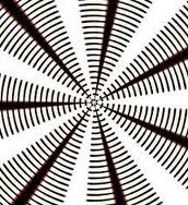
Used to divide space, direct the eye, and create forms. At the most basic level, straight lines are found in layouts to separate content, such as in magazine, newspaper, and website designs.
SHAPE
shapes are at the root of design. used to establish layouts, create patterns, and build countless elements on the page.
COLOR
Color is an interesting element of graphic design because it can be applied to any other element, changing it dramatically. It can be used to make an image stand out, to show linked text on a website, and to evoke emotion.
TYPE
the goal is to not to just place some text on a page, but rather to understand and use it effectively for communication. Choice of fonts (typefaces), size, alignment, color, and spacing all come into play.
ART,ILLUSTRATION & PHOTOGRAPHY
A powerful image can make or break a design. Photographs, illustrations and artwork are used to tell stories, support ideas, and grab the audience's attention.
TEXTURE
Texture can refer to the actual surface of a design or to the visual appearance
of a design. In the first case, the audience can actually feel the texture, making it unique from the other elements of design
of a design. In the first case, the audience can actually feel the texture, making it unique from the other elements of design
PRINCIPLES OF GRAPHIC DESIGN
BALANCE
SYMMETRICAL BALANCE
Symmetrical balance occurs when the visual weight of design elements evenly divided in terms of horizontal, vertical, or radial. This style relies on a balance of two similar elements from two different sides. Conditions in the symmetrical equilibrium is a general style that is often used to achieve a balance in design
ASYMMETRYCAL BALANCE
Asymmetrical balance occurs when the visual weight of design elements are not evenly distributed in the central axis of the page. This style relies on visual games such as scale, contrast, color to achieve a balance with irregular. We often see a design with the big picture offset by the small but visible text balanced because the game contrast, color
CONTRAST
Contrast occurs when two elements are different. The greater the difference the greater the contrast. contrast is to make sure the differences are obvious. Four common methods of creating contrast are by using differences in size, value, color, and type.
EMPHASIS
emphasis is applied to individual parts such as a word or phrase by changing its appearance, making it stand out. Sometimes considered a principle of design on its own, emphasis can be created using all of the various elements and principles of design.
PROPORTION
Proportion describes the size or scale of an object. Typically the proportion is subjective and is in relation to the image as a whole, other objects within the image, or other objects adjacent to the image
PATTERN
Pattern uses the art elements in planned or random repetitions to enhance surfaces of paintings or sculptures. Patterns often occur in nature, and artists use similar repeated motifs to create pattern in their work. Pattern increases visual excitement by enriching surface interest.
FINAL PROJECT


No comments:
Post a Comment